
Thursday, September 26, 2019
Monet
Andy Warhol- Campbell's Soup Cans

Starry Night 1989- Vincent Van gogh

Midterm: Liz Whaley

Midterm: Andy Warhol

Andy Warhol is an American artist, director and producer in pop art. I love the vibrant colors he uses. I like the way all the colors go together and he keeps the constant yellow in her hair. How he uses expression, advertising, and celebrity culture to make art. Therefore, for my midterm painting I want to be able to paint a painting with various colors. I want to try to use very bright colors and get out of my comfort zone. I am used to painting with very natural colors because I am afraid of it being bold or calling to much attention to it.
Midterm: Rene Magritte, The Son Of Man.

Paul Signac: La Baie (Saint-Tropez)

Ed Fairburn or Mark Powell

To the Soul (2018) by Mark Powell

Cambridge II (2014) by Ed Fairburn
I am interested in doing my mid-term project on the basis of how Mark Powell and Ed Fairburn's style of art. I like their unconventional style of using pieces other than the traditional paper or canvas as the medium to create art. Mark Powell often uses documents, envelopes, maps, and newspaper to draw on. Ed Fairburn mainly uses maps to create masterpieces. I'm thinking of creating my mid-term project in the same way as these two artists, using pieces other than blank paper or canvas.
Jules Joseph Lefebvre

I'm choosing to do a painting inspired by Jules Joseph Lefebvre. He was a professor, artist and theorist. He is known for several art pieces like The Death of Priam and the famous Mary Magdalene in the Cave which hangs in the Hermitage Museum in Saint Petersburg.
Wednesday, September 25, 2019
Tuscan Saguaros by Theresa Paden

This piece of artwork is called Tuscan Saguaros by Theresa Paden. I decided to pick this because I really enjoy the colors and the scenery. When I look at this painting I get a sense of feeling very calm and at ease. This was actually uploaded recently on February 2nd, 2019. Again I really enjoy all of the colors she used and how the paint job is not perfect.
Midterm: Jackson Pollock

Midterm Painting: Jay McClellan: Chocolate Labs

A Pine Tree-- Henri-Edmond Cross

This piece created in 1905 by Henri-Edmond Cross uses the style pointillism which is a technique of painting in which small, distinct dots of color are applied in a pattern to form an image. Many of Cross's paintings involve naturistic sceneries using a lot of green shades. For my midterm project, using the pointillism technique and the beautiful scenery choices of Cross, I want to create a large willow tree using shades of dark blue, purple and green with a lighter blue, yellow and orange sky background.
Midterm:Georgia O'Keeffe
Hibiscus with Plumeria
(1939)

Georgia O'Keeffe was a famous American artist, known as the "Mother of American Modernism". Her paintings of enlarged flowers, New York skyscrapers, and New Mexico landscapes is what she is well known for. In regards to my midterm, I would like to create a painting that mimics the work of O'Keeffe. In particular, the painting above stood out to me the most. I like the tropical colors that are used as well as the design. Therefore for my midterm, I would like to use similar color patterns. And I will be sketching out a drawing of something related to nature of some sort in a zoomed-in scale (most likely flowers/roses).
Midterm Project Inspiration: Hokusai Koi Woodcuts

Hokusai Koi Woodcuts: Two Carp
Being an avid lover of aquaria, I find this piece to be absolutely STUNNING. The carp are depicted overlapping one another which is actually extremely realistic. Koi fish are just fancy carp, and if you were to drop food in a koi pond, all of these majestic fish would be one on top of the other trying to get to the food first. Drawing fish is one of my favorite things to do and it is something that I have been working to perfect since I was a kid. I am looking forward to creating an illustration of my own while drawing inspiration from this masterpiece.
Tuesday, September 24, 2019
Charles R. Knight

Thursday, September 19, 2019
Eagle Robert Rauschenberg
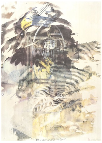
This a 1997 piece of artwork called "Eagle" by Robert Rauschenberg. Rauschenberg was an American contemporary artist who used paint, canvas, sculpture and many other mediums to create his work. I choose this art piece because of its complexity. At first glance, it doesn't look like there is anything to the piece. The more I looked at it the more I could recognize different parts, such as the eagles face and claw.
Robert Rauschenberg

I love this collage and how all the colors are very dark although you do have red, yellow and orange but goes perfectly with the theme. The skeleton in the middle as well, and all these animals, trucks, and store fronts. There is no real structure to it is all randomized but it feels as if they're all fit into perfect squares. This painting makes me think of things that are necessary or things we enjoy as human beings. He has art inside of art which a lot of people enjoy. They have a beach umbrella and animals. I really love this collage and the colors he uses and the way placed it all.
Robert Rauschenberg- Booster

Robert Rauschenberg - The Untitled

This art was made in 1954. It was named the Untitled by Robert Rauschenberg. I chose this one becasue of the colors and how it is unique. the different patterns and colors. Though it doesn't mane any sense to me personally, but it makes pictorial sense. It looks attractive and it makes me wonder what he was thinking when he was doing this.
Arcanum XII

Robert Rauschenberg was an American artist who contributed to the pop art movement which occurred in the 1950's. I really liked this piece of art because, although the parts of it really don't have anything to do with each other, they still go well together. The colors are subtle with pops of color but they somehow combine to form something very appealing to the eye.
Mother of God

This art piece is called Mother of God. It was created in the 1950's and it's in the early times of Robert Rauschenberg artistic career during the possibility of what the destruction of the atomic bomb could have during the Cold War. This piece is a round solid white circle on top of pieces of city maps and a small newspaper clipping which is on the bottom right hand corner. This piece is simple yet powerful almost signifying what is missing, or what was destroyed. It captures my attention because it's simplicity is most profound and complex.
Wednesday, September 18, 2019
Overseas Culture Interchange Robert Rauschenberg

This Robert Rauschenberg painting is from 1991. The words "National Gallery of Art" and "USA" are written in the top middle portion of the page. This painting displays what I think is a person in a city going toward their bike. At first I thought that it was NYC but looking further, I think the scattered stamps and images around the painting are meant to be passport stamps from all the different places whomever is going. The bike can be a symbol of something that is common almost everywhere you go.
Bed by Robert Rauschenberg

Robert Rauschenberg: Retroactive I

Robert Rauschenberg: Retroactive I (1963)
This Rauschenberg piece is a collage that includes the faces of a generation and is the first in his "Retroactive" series of works. The astronaut is symbolic of a monumental time in the history of our country. President JFK is the centerpiece of this piece, and he is surrounded with colors and images that give the feel of the time period in which it was composed.
Stone Moon: Robert Rauschenberg

This is Stone Moon by Robert Rauschenberg. It was made Oct, 28th 1969 In this collage there are pictures of Apollo 11 and the story of its journey to the moon. The pieces are from a the Stone Moon Book which talks about the moon landing and the space program and pictures NASA and two other photographers. My favorite part of this piece of artwork is how the words blend into the pictures as if it was a part of them. Also how the only colored part is the Rocket Fumes lighting up the words which pulls together the ultimate purpose for all the work put into the space program.
Robert Rauschenberg-Estate
Estate (1963)

Robert Rauschenberg is well known for using non-traditional materials and objects to make useful in various combinations. He used contrasting images such as Statue of Liberty, Michelangelo's painting (Last Judgment), a 1962 rocket launch, and a glass of water in the artwork above. It's a distant approach that he took by incorporating photography and painting into one canvas. However, the idea of creating a collage from newspaper photographs, art reproductions, and his own snapshots to canvas is pretty interesting. The overall artwork is very eye catching and unique. I believe it's pretty impressive because you don't see much of this form of artwork and being able to make it work.
Robert Rauschenberg-- Tate

This 1981 poster by Robert Rauschenberg titled Tate is a great example of his collage work. This, along with other pieces of his work is a part of an exhibition in the Tate Gallery. The background, though there is some empty space, is embroidered with a diamond-like pattern. The brightly colored circle is the first thing I noticed because of its uniqueness. It's off-centered which is pleasing to the eye and is surrounded by the words "The Tate, Rauschenberg". It is also signed by the artist in the lower right corner in the same black sharpie. The piece as a whole is very uniform in that it consists of dull cutout pieces of varied topics like the top of a ship, a Japanese blossom trees, and an eagle.
Robert Rauschenberg- Earth Day

Rauschenberg completed this piece in 1970. He specialized in abstract expressionism. I liked this particular piece by him because he spoke to the theme of Earth Day. His way of interpreting the vibe of earth day in the 70's was dark and dismal. Usually when people think of Earth day is all shades of greens and earthy tones with the idea of planting trees and recycling. Rauschenberg took it a different way with images of the land being destroyed due to making, and the waters being contaminated. I like how he put a bald eagle in the center of this photo as well because it is Americas emblem. Typically and especially after the war back then Americans were very patriotic but their selfish actions have been harming the habitat of their very own symbol of patriotism. The message he is trying to get across is very clear.
Robert Rauschenberg: Domicile

Robert Rauschenberg

Robert Rauschenberg

Robert Rauschenberg made Monogram between 1955-1959. This piece of artwork is a stuffed goat with a tire around the center of the goat. This is actually known as Rauschenberg's most famous pieces. I decided to pick this one because I have never seen anything like this before. I really like how the goat has some colors in the front of its face and would love to know the reasoning of why he picked a tire around the goats waist. The horns are beautifully portrayed and overall I think this is a very interesting piece.
Tuesday, September 17, 2019
Robert Rauschenberg

This piece is called "Estate", it was made in 1967. It is currently in the Philadelphia Museum of Art. It shows small pictures of New York City. They say that it is suppose to show the forgotten details in every day life. I could understand the concept behind this collage. If you live in NYC you constantly always see street signs, buildings, railroad tracks, the statue of Liberty. To some, this may just be their every day life and not think much of it. But to others, this is a work of art. They don't take it for granted, they think seeing street signs, buildings, railroad tracks, and the statue of Liberty are gorgeous. I am a New Yorker do not think much of street signs because I see them every day. Seeing the statue of Liberty, or large buildings like skyscrapers are breathtaking. It's just something you can't take your eyes off of.
Romare Bearden

Romare Bearden - Baptism

Monday, September 16, 2019
Dream Images

Sunday, September 15, 2019
Pittsburgh Memory 1964

Romare Bearden blends African culture with Popular Culture in his art pieces. In this piece there are two men just staring back at you, one wearing a hat with his hand on his chin made in a black and white collage with buildings in the background. I find this piece interesting because of how he made it look like a distorted collage, yet the eyes of these men are clear.
Thursday, September 12, 2019
Romare Bearden

I love the colors on this painting it looks like something that will be in the subway station in New York City. They make great use of all of the colors. However, the man playing the piano face seems very strange compare to the others. I like how the wall has squares in the back and somehow he is able to use the pink and white stand out. I enjoy the different music instruments and music notes in this painting.
Romare Bearden: Circe

This artwork, "Circe"was created by Romare Bearden in 1977. Bearden was a collage and watercolor artist that used his artwork to tell stories about black culture and the civil rights movement. This is a collage of Circe, the goddess of magic; she has the ability to heal and kill a man. This piece of art is part of a series Bearden created to retell the story "The Odyssey"; where all the characters are represented by African Americans. I chose this piece because it represents a strong, powerful African American women, and I feel like there should be more representation of them in art.
Romare Bearden -Jazz Village

This is art was done by Romare Bearden in 1967. He named it the Jazz Village. I like this because it reminds me of Ghana. The colors, the drums, and the outfits. I see three black men playing musical instruments. I see the drums and the trumpets. They have stripe clothing with different patterns. Outfits screams Africa to me! This guy seem to be very interested into music and sort of like a hip hop artist. He must be doing a series for something.
Wednesday, September 11, 2019
Romare Bearden

This piece of artwork is called Bessie, Duke, and Louis which was made in 1981. This painting was about three great jazz legends Louis Armstrong, Duke Ellington, and Bessie Smith. I decided to pick this piece of artwork because the colors really stood out to me. I also love music and was very pleased when I heard it was about these incredible jazz legends.
The Sea Nymph: Romare Bearden

This is the Sea Nymph, created in 1977 by Romare Bearden. Usually these projects are no larger than 14 by 18 inches and would be photographed to be blown up in larger proportions. The story to the painting is supposed to portray the greek mythology story in which Odysseys is dragged underneath into the ocean. I find this piece very interesting in the color ocean colors of blue and green chosen to show a sinking nature. The wavy patterns also mesh well with the idea of water and ocean plants making the picture come alive and tell a story.
Romare Bearden
The Sea NymphRomare Bearden was an artist who was well known for his collages using magazine clippings. In this collage, Bearden displayed two sea nymphs in his collage. A sea nymph is a female spirit of sea waters. I chose this collage cause it was vibrant and different from the other collages he normally did. I almost see a pirates boat on the top of the water and birds circling the water below, where two sea nymphs are swimming in a stormy sea.
Mother and Child (1972) by Romare Bearden

This is Mother and Child (1972) by Romare Bearden. Bearden has other artworks titled "Mother and Child" but this one stood out the most to me. Compared to his other works that are named the same, this had the most composition to it. He used solid colors, as well as patterns to create the piece. The mother's eyes caught my eye. It's as if she is staring straight at the viewer and about to tell some story. Personally, I feel like you can get a very wise personality coming just from the piece. Also, there is a mother holding her child, while holding a bamboo that separates another family walking out into the distance. It somewhat seems as though that the two people in the back is the mother and child in foreground.
Romare Bearden - Calm Sea
Calm Sea (1987)

This painting captured my attention out of all of Romare Bearden's artwork. The name Calm Sea says a lot about the painting right away. When I look at this painting I actually feel calm. I believe the mixture of colors as well as the location can reflect to the mood of quiet and peaceful. What stood out to me was the face painted on the left corner, which I didn't realize after 10 minutes of staring at it. The two things that I like the most is the black woman figure and the birds, it adds a lot to the overall painting.
Romare Bearden-- New Orleans: Ragging Home

Romare Bearden was an African-American artist who specialized in collages, watercolors, oils, and photomontages. The image above was created in 1974 and combines watercolor painting with a collage-like style. The crowd of people seems to be playing instruments down the streets of New Orleans which is an exotic place itself. The town is filled with life, culture, and unity which is expressed through the color choices. The blending colors of blue and green which make up the sky tie into the street performers' attire and overall impression. Though we cannot see the faces of the people, the vibe of the city is electric. This painting makes me want to visit New Orleans :)
Romare Bearden- Jazz II (1979)

Romare Bearden- Jazz II (1979)
Bearden illustrates a mastery of the collage in each of his pieces. I was able to view many of his works, but to me this one stood out. This collage has so much life and vibrancy, and it reminds me of a popular nightclub. You can see instruments being played in the forefront of the picture along with piano keys creatively included in the background. Additionally, there are a few smiles in this piece and the color scheme gives off a very upbeat, joyous feeling.
Romare Bearden: The Block


Subscribe to:
Posts (Atom)